Paper sizes
Most documents will be created in one of the standard ISO216 'A paper sizes', please use this graphic as a guide to sizing your document correctly. Please ensure you add bleed to your document, see below.
Bleed and crop marks
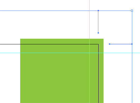
If your artwork runs to the edge of a page it will need a bleed. This means the artwork will bleed over the edge, usually printers ask for 3mm. When the artwork is printed, it’s printed on a larger oversized sheet then trimmed down to the right size. If you don’t allow for a bleed your artwork might end up not running to edge of the page and have a white gap. Include crop marks when you save your file, this will show the printers where your bleed is and where they should trim the document.
Colours
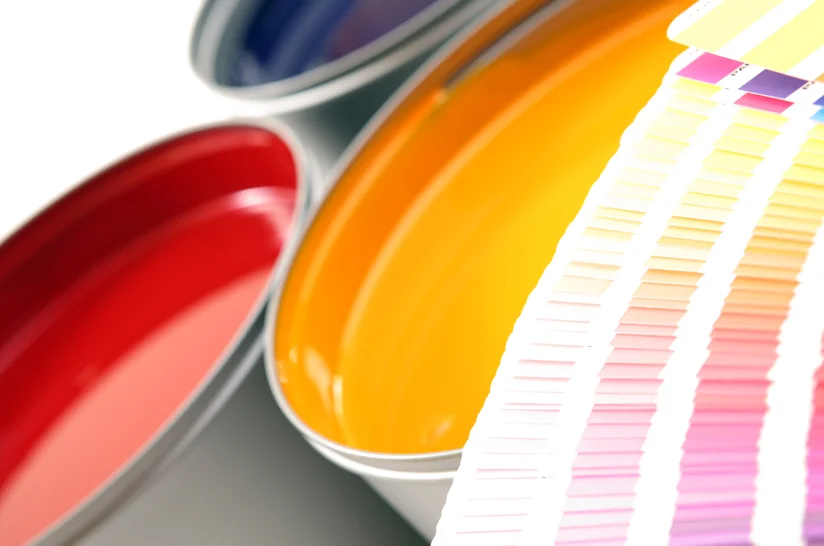
Printers use CMYK (Cyan, Magenta, Yellow and Black), whereas on screen most office environments use RGB (Red, Green, Blue). You need to ensure your document is set up in CMYK, otherwise your print could come back not how you expected. When you convert your image from RGB to CMYK it may appear duller, you may have to brighten up the colours to compensate.
If your project is being printed in pantone colours the above does not apply. Pantone colours are solid colours that are often referred to as spot or special colours. Most companies will use pantone colours at some stage as part of their corporate identity.
Colour matching
Printers will match colour using the international standard pantone colour system or its CMYK equivalent. It is important to avoid using your PC as a guide to colour as each screen can be calibrated differently and most use RGB. The same is also true of desktop office printers. Your printer can guide you in this area and provide proofs if necessary of how your colours might reproduce.
Convert fonts to outlines
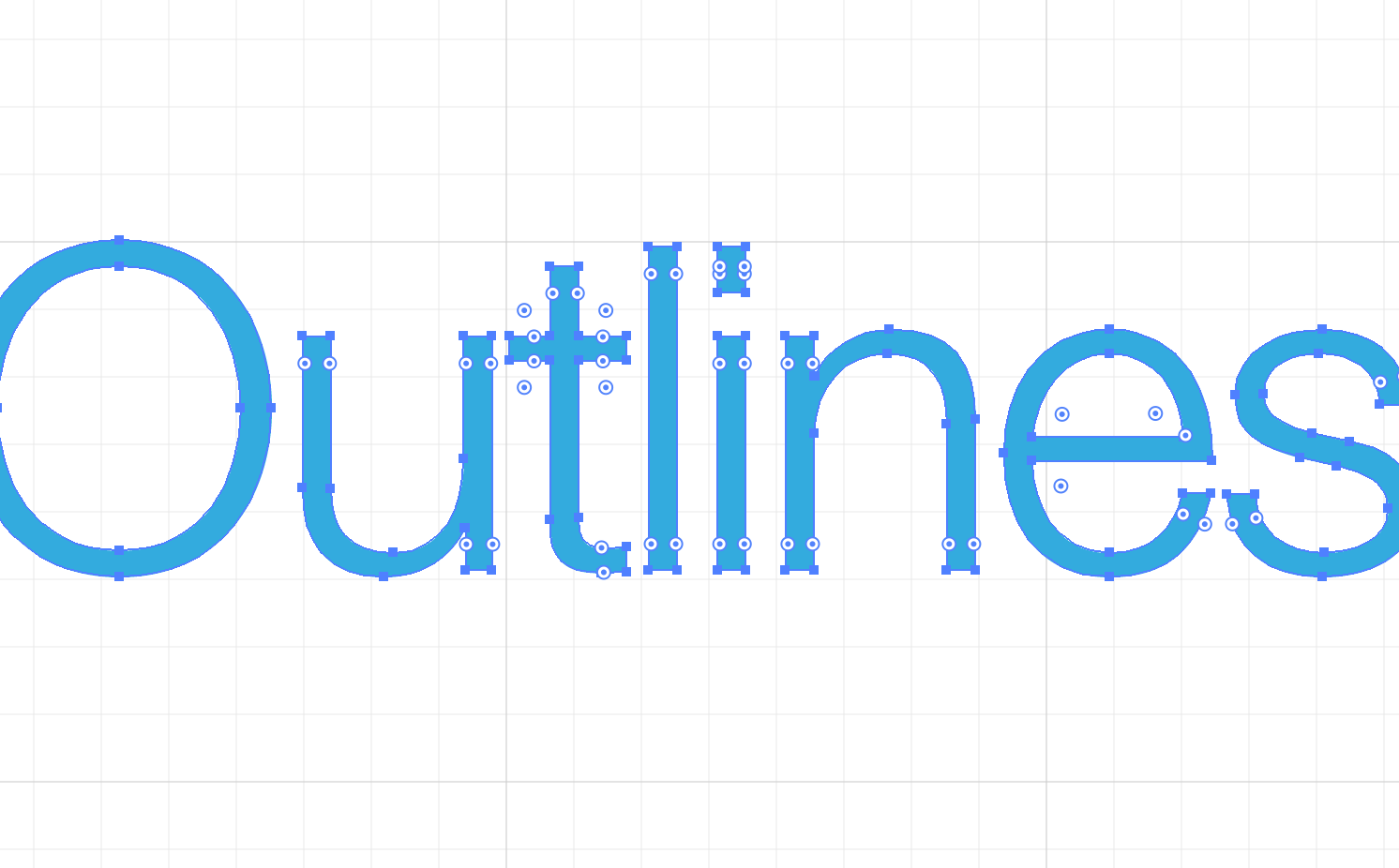
It’s important that when you send a document to print you convert the fonts to outlines. This basically means that rather than the type being an editable font, you change it into a shape. This will stop any font issues occurring at the printer’s side and ensures your content can't reflow. In Adobe Illustrator or Indesign it’s as simple as selecting all your type and then clicking Type> Create Outlines.
Important: Always save out a separate file once you've changed type to outlines, don't overwrite your original file, ensuring that file remains editable.
Image resolutions
On screen we view images at around 72dpi, however printing requires a much larger resolution, usually about 300dpi for things like brochures and flyers. This means you can’t use low resolution images as they will appear pixelated, you will need a larger image file. You can check the image resolution in Photoshop by selecting Image> Image Size, ensure it's 300dpi at the size you want to reproduce it at.
Supply your file as a PDF
You can create a PDF file from most programs now, and it’s easiest file for printers to use. When saving your PDF you can select to include crop marks and bleed, you can also ensure the resolution you want to save the file at. If you are designing a brochure, supply the PDF as separate pages, not spreads, this includes the front and back cover, and don’t try and impose your brochure, your printers will do that using their imposition software.
You can also run a preflight check in Adobe Acrobat, and you can set it up to check for various things, such as image resolution, bleeds, spot colours etc. This is really helpful to check that you haven’t missed anything.
Creep allowance
Creep is something that affects stitched brochures. It’s where the bulk of the paper causes the inner pages to extend or creep further out that the other pages. It varies depending on the thickness of the paper and number of pages. If you are sending a thick stitched brochure to print, check that your printer will adjust your document for you.
Transparencies and effects
If your file has unusual effects or transparencies, its far better to send flattened transparencies, just incase something goes wrong along the way. If you want to make sure it’s going to look as its supposed to it might be worthwhile sending your printer a flat JPEG of your artwork alongside your PDF or even sending then a printed hard copy that they can check against.
Fold and die-cutting guides
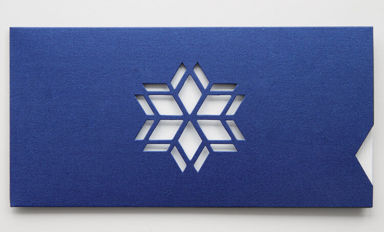
Make sure your template clearly shows where the fold or cutting guide is, use a separate colour for the guides that really contrasts against the artwork, leave this colour set as a spot colour and ensure the guide is set to 'overprint'.
Foil blocking and spot UV
As with die cutting guides, define the artwork that you want to foil block or varnish in your PDF file as a separate colour, again left as a spot colour. If you prefer you can supply a separate PDF file with just the area you want foil blocking or gloss varnishing.
Proof read, then proof read again!
Your content is exactly that, your content, ensure you've read it through thoroughly. Unless specifically commissioned to provide proof-reading services, printers won't check your content. Therefore if you approve a proof for print and an error is noticed at a later stage the printer cannot accept responsibility and has the right to charge in full for a subsequent reprint. So it is important to take your time and check content carefully.
Useful downloads
Advice sheet: Image bleed
Advice sheet: Newsletter weight calculator
Advice sheet: Paper size guide (ISO216)
Advice sheet: Working with colours
Advice sheet: Folding formats
Template file: A3 Landscape
Template file: A3 Portrait
Template file: A4 Landscape
Template file: A4 Portrait
Template file: A5 Landscape
Template file: A5 Portrait
Template file: A6 Landscape
Template file: A6 Portrait
Template file: Business card Landscape
Template file: Business card Portrait
Template file: DL Landscape
Template file: DL Portrait


